
Images are still the heaviest part of most websites. On a typical page, they account for roughly half of the total transferred bytes, and they are usually the element responsible for the Largest Contentful Paint. The good news: you can cut image weight by 60 to 85 percent without any visible loss of quality, as long as you follow a consistent process instead of dragging photos straight from a camera folder into your CMS.
This guide shows exactly how to optimize images for web projects: which format to choose, what pixel dimensions to export, which compression levels stay invisible to the human eye, and how to deliver everything with the right HTML. We also include before and after benchmarks from real files and a repeatable checklist you can apply to every project. Anyone digging further should read ImageOptim HTTP API for optimization on web servers.
The short answer
- Format: AVIF first, WebP as fallback, JPEG as last resort for photos. SVG for logos, icons and flat illustrations. PNG only when you need lossless pixels or crisp screenshots with text.
- Dimensions: never serve an image wider than 2x the largest CSS slot it will occupy. Most content images do not need to exceed 1600 px wide.
- Compression: JPEG quality 75 to 82, WebP quality 72 to 80, AVIF quality 45 to 60. Those ranges are visually lossless for almost all photographic content.
- Delivery: use
srcsetandsizes, addwidthandheightattributes, lazy load everything below the fold, and setfetchpriority="high"on the hero image only. - Budget: hero images under 150 KB, content images under 80 KB, thumbnails under 25 KB.

Step 1: Choose the right image format
Format choice does more for file size than any compression slider. Picking JPEG when the asset should be SVG can mean a 40x difference in bytes.
| Format | Best for | Transparency | Typical saving vs JPEG | Support status |
|---|---|---|---|---|
| AVIF | Photos, hero banners, gradients, large backgrounds | Yes | 45 to 60 percent smaller | All current major browsers |
| WebP | Photos, product shots, UI graphics, animated assets | Yes | 25 to 35 percent smaller | Universal, including older Safari |
| JPEG | Universal fallback, email, third party feeds | No | Baseline | Everywhere |
| PNG | Screenshots with text, pixel art, lossless masters | Yes | Usually larger | Everywhere |
| SVG | Logos, icons, charts, flat illustrations | Yes | Often 90 percent smaller | Everywhere |
Simple decision rule
- Is the graphic made of shapes, text or flat colours? Use SVG and stop here.
- Is it a photograph or a complex image? Export AVIF plus a WebP fallback.
- Does it need pixel perfect text, like a UI screenshot? Try PNG first, then compare it with lossless WebP, which is often 20 to 30 percent smaller.
- Is it an animation? Prefer a muted, looping MP4 or WebM video over an animated GIF. A 3 MB GIF often becomes a 200 KB video.
Step 2: Set the correct pixel dimensions
Most oversized images are not a compression problem, they are a resizing problem. A 5000 px wide photo displayed in a 700 px column wastes about 95 percent of its pixels. Resizing before compressing is the single biggest win.
The 2x rule
Take the widest CSS width the image will ever occupy, then multiply by 2 for high density screens. That is your maximum export width. Going beyond 2x brings no visible benefit on any current display. You’ll find this handled well over at cms-love.com.
| Slot | CSS width | Export widths to generate | Target weight |
|---|---|---|---|
| Full width hero | up to 1440 px | 640, 1024, 1600, 2048 | under 150 KB |
| Blog content image | 720 to 800 px | 480, 800, 1200 | under 80 KB |
| Product card | 300 px | 300, 600 | under 35 KB |
| Avatar or thumbnail | 80 px | 80, 160 | under 10 KB |
| Logo | any | SVG, single file | under 8 KB |
Quick check: open your page in Chrome DevTools, hover an image in the Elements panel and compare intrinsic size with rendered size. If the intrinsic width is more than double the rendered width, you are shipping dead weight.
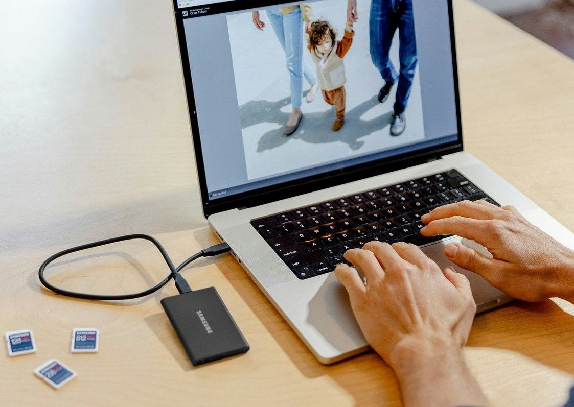
Step 3: Pick compression levels that stay invisible
Quality sliders are not comparable across formats. AVIF at quality 50 looks like JPEG at quality 80. Use these tested ranges as your starting point, then check the result at 100 percent zoom on a good screen.
| Format | Safe quality range | Use lower end for | Use higher end for |
|---|---|---|---|
| JPEG | 75 to 82 | Busy textures, foliage, crowds | Skin tones, skies, gradients |
| WebP | 72 to 80 | Thumbnails, small cards | Hero images, portfolio shots |
| AVIF | 45 to 60 | Backgrounds, decorative photos | Product detail, fine text in image |
| PNG | Palette reduction to 128 or 256 colours | Flat UI graphics | Screenshots with gradients |
Three habits that protect quality
- Always compress from the original master, never from an already compressed file. Re-compressing a JPEG stacks artefacts permanently.
- Strip metadata such as EXIF, GPS and thumbnails. This removes 10 to 60 KB per photo for free, and it also removes location data you may not want to publish.
- Sharpen slightly after downscaling, not before. A small amount of output sharpening (radius 0.3 to 0.5) restores the perceived crispness lost in resampling.
Step 4: Real before and after benchmarks
Below are results from five common asset types. Every file was resized to its target width first, then encoded with Squoosh and the cwebp / avifenc command line tools. Visual inspection was done at 100 percent zoom on a 27 inch display.
| Asset | Original | Resized JPEG q80 | WebP q75 | AVIF q50 | Total saving |
|---|---|---|---|---|---|
| Hero photo, 4000 px camera JPEG resized to 1600 px | 4,180 KB | 212 KB | 128 KB | 74 KB | 98.2 percent |
| Product shot on white, 1200 px | 890 KB PNG | 96 KB | 58 KB | 37 KB | 95.8 percent |
| Blog content image, 800 px | 1,340 KB | 74 KB | 46 KB | 29 KB | 97.8 percent |
| UI screenshot with text, 1200 px | 640 KB PNG | Not recommended | 148 KB lossless | 121 KB | 81.1 percent |
| Company logo | 184 KB PNG | n/a | n/a | 4 KB SVG minified | 97.8 percent |
Two lessons stand out. First, resizing does most of the work: the jump from 4,180 KB to 212 KB happened before any format change. Second, AVIF roughly halves WebP on photographic content, which is why a modern pipeline should output both.
Step 5: Deliver the right file to the right device
Exporting good files is only half the job. The browser needs to know which one to download.
Responsive markup with picture, srcset and sizes
<picture>
  <source
    type="image/avif"
    srcset="hero-640.avif 640w, hero-1024.avif 1024w, hero-1600.avif 1600w"
    sizes="(max-width: 768px) 100vw, 1200px">
  <source
    type="image/webp"
    srcset="hero-640.webp 640w, hero-1024.webp 1024w, hero-1600.webp 1600w"
    sizes="(max-width: 768px) 100vw, 1200px">
  <img
    src="hero-1024.jpg"
    alt="Team reviewing website performance metrics"
    width="1600" height="900"
    fetchpriority="high" decoding="async">
</picture>
Attributes that matter
- width and height: always present. They reserve space and prevent layout shift, which protects your CLS score.
- loading=”lazy”: on every image below the fold. Never on the hero, it delays LCP.
- fetchpriority=”high”: on the single LCP image only. Used everywhere it loses its effect.
- decoding=”async”: keeps the main thread free while the image is decoded.
- alt text: descriptive, natural, no keyword stuffing. It serves accessibility first and image search second.
Do not forget the CSS side
Background images defined in CSS are invisible to srcset. If a background is important visually, either move it into the HTML as a picture element or use image-set() so the browser can pick the best format.

Step 6: The repeatable workflow
Here is the exact sequence we use on every project. It takes about two minutes per batch once it is set up.
- Keep a master folder. Store full resolution originals outside the website. Never overwrite them.
- Crop to the final aspect ratio. Deciding the crop first avoids re-exporting later.
- Resize to the target widths from the table above. Generate 2 or 3 widths per image, not ten.
- Strip metadata and sharpen lightly.
- Encode to AVIF and WebP at the quality ranges listed, plus a JPEG fallback for the widest legacy support.
- Check against your budget. If a file is over budget, drop the quality by 5 points before reducing dimensions.
- Name files predictably:
page-topic-1600.avif. Descriptive, lowercase, hyphenated names help image SEO. - Upload, then verify in the field. Run PageSpeed Insights and check the Network panel to confirm the browser really downloaded the AVIF version.
Command line version for developers
# Resize and encode with sharp-cli
npx sharp-cli -i master.jpg -o hero-1600.webp resize 1600 --quality 75

# WebP with the official encoder
cwebp -q 75 -m 6 -metadata none hero-1600.jpg -o hero-1600.webp

# AVIF
avifenc --min 20 --max 35 --speed 4 hero-1600.jpg hero-1600.avif

# Minify an SVG
npx svgo logo.svg -o logo.min.svg
Which tools should you actually use?
| Tool | Type | Best for | Limitation |
|---|---|---|---|
| Squoosh | Free browser app | Side by side quality comparison, full control over AVIF and WebP | One image at a time |
| TinyPNG / TinyJPG | Free online, paid API | Fast batch compression, no settings to think about | No resizing control on the free tier |
| ImageOptim | Free desktop, macOS | Large local batches, metadata stripping | macOS only |
| ShortPixel / Imagify | WordPress plugin | Automatic conversion of an existing media library | Credit based pricing |
| sharp / libvips | Node library | Build pipelines and automated resizing | Requires development work |
| Image CDN (Cloudflare Images, Cloudinary, imgix) | Service | Large sites, on the fly format negotiation | Monthly cost, vendor dependency |
For a small site, Squoosh plus a plugin is enough. For anything with hundreds of images or user uploads, automate with sharp or an image CDN so nobody has to remember the rules.
Seven mistakes that quietly slow sites down
- Uploading straight from the camera or phone. A 4 MB photo in a 700 px column is the most common performance bug we find.
- Using PNG for photographs. PNG is lossless, so photos stay huge for no visual gain.
- Lazy loading the hero image. It delays the LCP by hundreds of milliseconds.
- Missing width and height attributes. Free layout shift, free ranking damage.
- Compressing twice. Running an already optimised JPEG through another compressor adds artefacts without meaningful savings.
- Ignoring CSS background images. They often escape every optimisation pass.
- Retina everywhere. 3x assets are almost never worth their weight.
How to verify the result
- Run PageSpeed Insights and look at the LCP element and the “Properly size images” and “Serve images in next-gen formats” opportunities.
- Open Chrome DevTools, Network tab, Img filter. Sort by size. Anything above 200 KB needs justification.
- Check the Type column to confirm AVIF or WebP is really being served, not the JPEG fallback.
- Compare a few images side by side at 100 percent zoom against the original. If you cannot tell them apart, you compressed correctly.
FAQ
Is PNG or JPEG higher quality for web?
PNG is technically higher quality because it is lossless, but that only matters for graphics with sharp edges, text or transparency. For photographs, a JPEG at quality 80 looks identical to the PNG while being 5 to 10 times smaller. Choose PNG for screenshots, logos and UI elements, JPEG (or better, WebP and AVIF) for photos. Much the same conclusion turns up on imagecompressor.com.
Which image optimizer is the best?
There is no single winner, it depends on volume. Squoosh gives the best manual control and visual comparison, TinyPNG is the fastest for quick batches, ImageOptim is ideal for large local folders, and sharp or an image CDN is the right answer once optimisation needs to run automatically. What matters more than the tool is resizing before compressing.
How do I get images to load faster on my website?
In order of impact: resize to the real display size, convert to AVIF or WebP, add srcset so mobile users get smaller files, lazy load everything below the fold, preload the hero image, and serve everything from a CDN with long cache headers. Those six actions typically cut image load time by more than half.
Does WebP or AVIF hurt SEO?
No. Google indexes both formats, and Google Images supports them. Serving lighter images improves Core Web Vitals, which is a positive ranking signal. Just keep descriptive filenames, alt text and an image sitemap entry where relevant.
What quality setting should I use for WebP?
Quality 75 is the sweet spot for most photos. Go down to 70 for decorative or small images, up to 80 for hero images and portfolio work where detail matters. Below 60 you start seeing banding in skies and blotches in skin tones.
Should I still provide a JPEG fallback?
WebP is supported by effectively every browser in use, so a WebP fallback behind AVIF is enough in most cases. Keep a JPEG fallback if your audience includes very old devices, or if images are reused in emails, marketplaces or social feeds that do not accept next generation formats.
How large should a web image be in KB?
Aim for these budgets: hero image under 150 KB, in-content image under 80 KB, product card under 35 KB, thumbnail under 10 KB, and a total image payload under 1 MB per page. Hitting those numbers with AVIF or WebP is realistic without any visible loss of quality. It is argued more carefully on getpagespeed.com.
Wrapping up
To optimize images for web reliably you only need three decisions repeated consistently: the right format, the right pixel dimensions, and a compression level that stays inside the visually lossless range. Add responsive markup and correct loading attributes, and most sites cut their image weight by 70 percent or more while looking exactly the same.
Set the workflow up once, document the export widths for your design system, and every new image will land on the site already optimised.
