
If you design for the web but still feel intimidated the moment you open a code editor, this guide is for you. CSS Grid is the most powerful native layout tool the web has ever had, and the good news is that it thinks the way designers already do: in rows, columns, and rectangles on a page. See w3schools.com for their take.
In this beginner friendly guide, we’ll approach CSS Grid visually first, then translate each concept into short code snippets you can copy, paste, and reuse in your own projects. No Bootstrap, no Tailwind, no framework overhead. Just the browser doing what it does best.
Why CSS Grid Matters for Designers in 2026
For years, designers relied on floats, tables, or heavy frameworks to build layouts that looked like the mockups they created in Figma. CSS Grid changed that. It brings two dimensional layout control directly into the browser, meaning you can position elements across rows and columns at the same time, just like you would in a design tool. You can read more here.
Compared to Flexbox (which is one dimensional and best for aligning items in a single row or column), Grid is what you reach for when the whole page or a full section needs structure.
Grid vs Flexbox at a Glance
| Feature | CSS Grid | Flexbox |
|---|---|---|
| Dimensions | Two (rows and columns) | One (row or column) |
| Best for | Page layouts, dashboards, galleries | Navigation bars, button groups, small components |
| Design mindset | Draw the grid first, then place items | Line up items along one axis |
The short version: use Grid for layouts, use Flexbox for components. They work beautifully together.

Step 1: Think Like a Grid Before You Code
Open any website you love and squint at it. You’ll start noticing invisible lines: a header, a sidebar, a content area, a footer. That’s the grid.
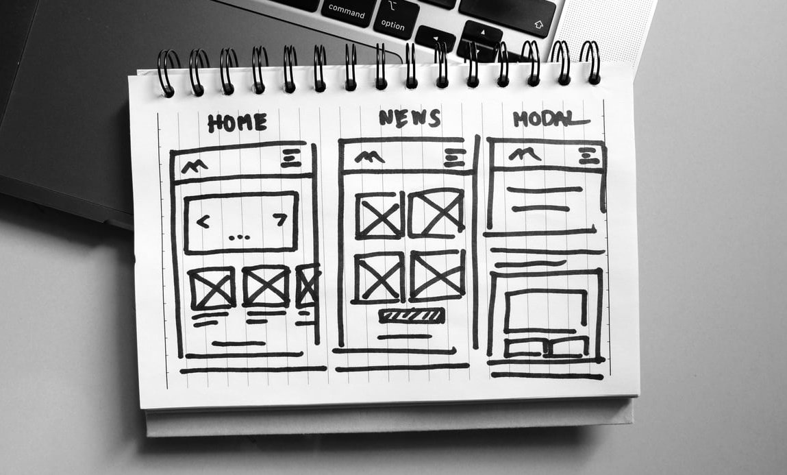
Before writing a single line of CSS, sketch your layout on paper or in Figma. Ask yourself:
- How many columns do I need?
- How many rows?
- Which elements need to span multiple cells?
- Where should gaps appear between blocks?
Once you can see the grid, writing it takes minutes.
Step 2: The Core Vocabulary You Actually Need
You don’t need to memorize the entire spec. These six properties will carry you through 90% of real world layouts:
- display: grid turns any element into a grid container.
- grid-template-columns defines the columns.
- grid-template-rows defines the rows.
- gap adds spacing between cells.
- grid-column tells an item how many columns to span.
- grid-row tells an item how many rows to span.
The Magic of the fr Unit
The fr unit stands for “fraction of the available space”. Instead of calculating percentages, you tell the browser how to divide what’s left.
.container {
  display: grid;
  grid-template-columns: 1fr 2fr 1fr;
  gap: 20px;
}
This creates three columns where the middle one is twice as wide as the outer two. Resize the window and it stays proportional. No media queries needed.
Step 3: Real Layout Examples You Can Copy
Example 1: The Classic Holy Grail Layout
Header on top, footer at the bottom, sidebar and main content in the middle. Every designer has built this at least once.
.page {
  display: grid;
  grid-template-columns: 200px 1fr;
  grid-template-rows: auto 1fr auto;
  grid-template-areas:
    "header header"
    "sidebar main"
    "footer footer";
  min-height: 100vh;
  gap: 16px;
}

.header  { grid-area: header; }
.sidebar { grid-area: sidebar; }
.main    { grid-area: main; }
.footer  { grid-area: footer; }
Notice how grid-template-areas lets you literally draw the layout with words. This is the most designer friendly feature in the entire CSS language.
Example 2: A Responsive Card Gallery Without Media Queries
This one still feels like magic the tenth time you use it:
.gallery {
  display: grid;
  grid-template-columns: repeat(auto-fit, minmax(250px, 1fr));
  gap: 24px;
}
Cards will automatically wrap, resize, and fill available space. On a phone you get one column, on a tablet two or three, on a wide screen as many as fit. No breakpoints written by hand.
Example 3: An Asymmetric Editorial Layout
Designers love magazine style compositions with one big hero image and smaller cells around it.
.editorial {
  display: grid;
  grid-template-columns: repeat(4, 1fr);
  grid-auto-rows: 180px;
  gap: 12px;
}

.hero {
  grid-column: span 2;
  grid-row: span 2;
}

.wide {
  grid-column: span 2;
}
Just add the class hero or wide to any child and it takes over the space you need. This is how you turn a boring list of blog posts into something that feels curated.

Step 4: Common Mistakes Beginners Make
- Forgetting display: grid on the parent. No grid without it.
- Mixing fixed pixels with fr units without thinking. Pixels don’t flex, fr units do. Use them intentionally.
- Over nesting grids. You can put a grid inside a grid, but ask yourself first if Flexbox would do the job for a small component.
- Ignoring implicit rows. If you place more items than your rows allow, the browser creates new rows automatically. Use grid-auto-rows to control their size.
- Not naming your areas. Named areas make your CSS readable months later.
Step 5: Tools That Speed Up Your Learning
You don’t need to code every layout from scratch to learn. These tools let you experiment visually:
- Firefox DevTools Grid Inspector: still the best in class, it overlays your grid with numbered lines directly in the browser.
- CSS Grid Generator: draw the layout, copy the code.
- Chrome DevTools: also shows grid lines and area names.
- CodePen: fork existing grid layouts and tweak them until you understand each property.

Putting It All Together
The best way to learn CSS Grid as a designer is not to read the entire specification. It’s to pick one layout you already love, sketch its grid, and rebuild it. Then another. Then another. Within a week you’ll stop reaching for frameworks for basic layouts, and within a month you’ll be building things that would have taken hours in Bootstrap.
Grid rewards visual thinkers. If you can draw it, you can build it.
Frequently Asked Questions
Is CSS Grid hard to learn for a designer with no coding background?
No. Grid is actually easier than older CSS techniques because it matches how designers already think. If you can plan a layout in Figma with rows and columns, you can build it in Grid within an afternoon.
Should I learn Flexbox or CSS Grid first?
Learn the basics of both in parallel. Use Flexbox for small components like buttons and navbars, and Grid for the overall page structure. They’re partners, not rivals.
What is the 12 column grid rule and does it still apply?
The 12 column grid comes from print design and was popularized by frameworks like Bootstrap because 12 divides evenly into 2, 3, 4, and 6. With CSS Grid you’re no longer locked into 12 columns. Use whatever number fits your design, from 4 to 16. This write-up is worth a look.
Do I still need media queries with CSS Grid?
Often not. Techniques like repeat(auto-fit, minmax()) handle most responsive needs automatically. Media queries are still useful for major layout changes, like switching from a sidebar layout on desktop to a stacked layout on mobile.
Is CSS Grid supported in all browsers?
Yes. As of 2026, every modern browser has full support, including subgrid. You can use Grid in production without any concerns.
Can I combine CSS Grid with animations?
Absolutely. You can animate grid-template-columns, grid-template-rows, and gap values with smooth transitions. This opens up creative possibilities that were nearly impossible a few years ago.
