
If you have ever opened a website on your phone and had to pinch, zoom, and squint just to read a single sentence, you already understand why mobile-first design exists. With more than half of global web traffic coming from smartphones, designing for the smallest screen first is no longer a trend. It is the standard way modern websites and apps are built.
In this guide, we will break down what mobile-first design really means, why it matters in 2026, and how small business owners and junior designers can start applying it today, even without a huge budget or a senior team.
What Is Mobile-First Design?
Mobile-first design is an approach where you design and build the smallest screen version of your website or app first, then progressively enhance it for tablets, laptops, and large desktop monitors.
Instead of creating a full desktop layout and trying to squeeze it into a phone screen later, you start with the essentials: the most important content, the clearest call to action, and the simplest navigation. Once that works beautifully on a 6-inch screen, you add more space, more visuals, and more features for larger devices.
In short, mobile-first is about priority. What does the user absolutely need to see, read, or click? Everything else comes after.
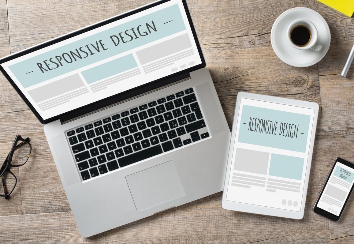
Why Mobile-First Design Became the Industry Standard
The shift to mobile-first did not happen by accident. It is driven by a mix of user behavior, technical performance, and search engine rules.
- Mobile traffic dominates: Most users discover websites through their phones, especially through social media and search.
- Google mobile-first indexing: Google primarily uses the mobile version of your site to decide how to rank it.
- Faster performance: Starting small forces designers to keep pages lightweight, which improves loading times on every device.
- Better focus: A small screen has no room for clutter. This forces you to ask hard questions about what really matters.
- Improved accessibility: Larger buttons, readable fonts, and clear contrast benefit every user, not only mobile ones.
Mobile-First vs Desktop-First Thinking
The easiest way to understand mobile-first is to compare it directly with the older desktop-first approach. Both can produce responsive websites, but the mindset is very different.
| Aspect | Desktop-First | Mobile-First |
|---|---|---|
| Starting point | Large screen layout | Smallest screen layout |
| Approach | Remove features for mobile | Add features for desktop |
| Content priority | Everything visible at once | Essentials first, extras later |
| Performance | Often heavy on mobile | Lightweight by default |
| CSS media queries | max-width breakpoints | min-width breakpoints |
A Concrete Example
Imagine you are designing a restaurant website.
Desktop-first thinking: You start with a huge hero image, a full menu in a sidebar, a reservation widget, an Instagram feed, and a Google Maps embed. On mobile, you hide the sidebar, shrink the map, and hope it still works.
Mobile-first thinking: You start by asking what a hungry visitor on their phone needs right now. Probably the menu, the address, the phone number, and a button to book a table. You design that perfectly first. Then, for tablets and desktops, you add the Instagram feed, larger photos, and a richer map.
Core Principles of Mobile-First Design
Whether you are sketching wireframes or coding in CSS, these principles will keep you on the right track.
- Content first, decoration later. Decide what information is critical before choosing colors or animations.
- Touch-friendly targets. Buttons should be at least 44 by 44 pixels so fingers, not just cursors, can use them.
- Readable typography. Use a base font size of at least 16px and generous line height.
- Single-column layouts. Stack content vertically. Avoid horizontal scrolling at all costs.
- Progressive enhancement. Add complexity only when the screen size justifies it.
- Performance budget. Compress images, limit fonts, and ship only the code you need.
How to Get Started With Mobile-First Design
You do not need to be a senior designer to apply mobile-first thinking. Here is a beginner-friendly process you can follow on your next project.
Step 1: Define the User Goal
Write one sentence describing what your visitor wants to do. For example: Book a haircut in under 30 seconds. This becomes your north star for every design decision.
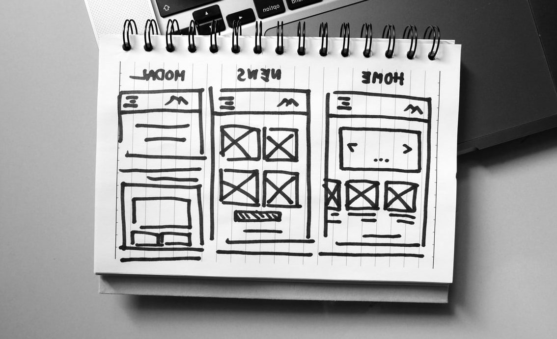
Step 2: Sketch the Mobile Version First
Grab paper or a tool like Figma and draw a vertical rectangle the size of a phone. Place only the elements that serve the user goal. If something does not earn its spot, leave it out.
Step 3: Build With min-width Media Queries
In CSS, write your base styles for mobile, then use min-width queries to add styles for larger screens. This keeps your code lean.
/* Base styles for mobile */
.container { padding: 16px; }

/* Tablet and up */
@media (min-width: 768px) {
  .container { padding: 32px; }
}

/* Desktop and up */
@media (min-width: 1200px) {
  .container { padding: 64px; max-width: 1100px; margin: 0 auto; }
}
Step 4: Test on Real Devices
Emulators are helpful, but nothing replaces holding an actual phone in your hand. Test on both iOS and Android, and on slower networks if possible.
Step 5: Iterate Based on Data
Use tools like Google Analytics or Hotjar to see where mobile users tap, scroll, and drop off. Improve those areas first.

Common Mistakes to Avoid
- Designing in Figma at desktop size and shrinking later. Start your artboard at 375px wide.
- Hiding important content on mobile. If it is not important enough for mobile, it is probably not important at all.
- Using tiny tap targets. Fingers are not pixels. Give buttons room to breathe.
- Loading huge desktop images on phones. Use responsive images with srcset.
- Forgetting about thumb zones. Place key actions in the bottom half of the screen where thumbs naturally reach.
Tools That Make Mobile-First Design Easier
- Figma: Great for designing mobile screens first with reusable components.
- Chrome DevTools: Lets you preview your site on dozens of device sizes for free.
- Tailwind CSS: Uses a mobile-first breakpoint system by default.
- Google PageSpeed Insights: Measures mobile performance and gives concrete fixes.
- BrowserStack: Tests your site on real mobile devices remotely.

Final Thoughts
Mobile-first design is not just a technique. It is a mindset that forces you to focus on what truly matters for your users. For small business owners, it means a website that actually converts visitors into customers. For junior designers, it means building habits that align with how the modern web works.
Start small, stay focused, and let the desktop version be the bonus, not the foundation. Your users, and Google, will thank you.
Frequently Asked Questions
What is mobile-first design in simple words?
It is the practice of designing a website for phones first, then expanding the design for tablets and computers. The smallest screen sets the priorities.
Is mobile-first design still relevant in 2026?
Yes, more than ever. Mobile traffic continues to grow, and Google still uses mobile-first indexing to rank websites. Ignoring mobile users means ignoring the majority of your audience.
What is the difference between mobile-first and responsive design?
Responsive design means your site adapts to any screen size. Mobile-first is a specific strategy within responsive design where you start with the mobile layout and scale up from there.
Do I need to redesign my existing website to be mobile-first?
Not always. If your current site already performs well on mobile and loads quickly, you may only need minor improvements. If mobile users struggle to navigate or convert, a mobile-first redesign is worth the investment.
What is a key characteristic of mobile-first design?
The clearest sign of a mobile-first site is that the mobile version feels complete and intentional, not like a stripped-down version of the desktop site.
